Care U: Where caregivers find their space
Have you ever had to take care of someone close to you because they were no longer on their own? When this situation lasts for a long time, it is hard to manage all the emotions that come with it. Caregivers, who are usually the closest people to the patient, must bear all the responsibility. Balancing their life with their new role as caregivers is not easy. This often leads to the loss of oneself, both because of the emotional distress that it entails and the lack of time.
For this reason we have designed Care U, an application to help caregivers to take care of themselves. Want to know more about it?

Research
First and foremost we carry out an analysis of the health and wellness market. A growing market with a projected growth around +5% per year between 2020 and 2025, according to the Global Wellness Institute.
Market analysis
Inside the wellness market we can find three main areas: health, psychological balance and social wellness. We wanted to put our focus on stress reduction, but we quickly realized that there are plenty of applications trying to solve that need.
All these existing applications are dedicated to treating stress syndromes, but none of them is taking into account its cause. Some names we looked at were: Calm, Petit BamBou or Headspace.
Work, a baby on the way, a loss… there are many reasons why we can feel stressed or overwhelmed. That is why we ask ourselves, can different types of stress be treated in the same way?

Competitive Analysis
After this first approach, we narrowed our research to know how the stress caused by a loss or illness was being treated on the wellness app market. We note there are few apps dedicated to the loss or help of a sick patient, but even fewer are dedicated to those who care for the sick.
Some of the applications we look were: Cancer.net, ChemoWave and Vik. All of them offer reliable information and can be used to record the symptoms caused by the disease. But none takes into account the role played by caregivers. So, let’s dig more into that!
Secondary Research, involving existing articles and statistics. *source : mbam.ci.com
- 5 million french people help a loved one affected by cancer
- 10% of them help their sick loved one on their own
- 2h54 average time spent per day by the caregivers
Qualitative research, digging more into the personal insights with one-on-one interviews. We conducted 6 interviews with people who had lived the experience of being caregivers of their relatives in difficult times. Most of them spotted the same aspects:
-
Lack of information during the whole process, either about the illness or just emotional tools to be prepared and managed all the steps that will come.
-
The illness more common of the relative they were caring for was cancer.
-
Managing time between taking care and keeping their own daily schedule was difficult.
-
Even some of them downloaded mental health applications, all of them agreed that they needed to do physical things, something non-digital to be able to disconnect.
Definition
From all the gathered information, we proceeded to use the Affinity Diagram. We made categories in order to regroup each finding and identify the insights.
-
Digital Detox #1
The need of non digital activities.
-
Personal care #2
The need to invest time on themselves.
-
Lack of time #3
The need to find balance between daily live and caregiving.
-
Professional help #4
The willing to receive professional help.
-
Move and relax #5
Different types of activities depending on how they feel.
-
Reliable information #6
Understand the process and how to be emotionally prepared to it.
With these aspects in mind, we tried to build the user persona.

Based on all the information collected so far we introduce you to Eva. Her husband Mathieu was diagnosed with lung cancer 4 months ago. Since Mathieu was diagnosed, Eva took charge of everything. It is increasingly difficult for her to reconcile her work as a business developer in the tech-consultant industry, although now she’s working part-time, and her new role as caregiver.
Eva feels stuck in a gear that she can’t stop. She would like to manage her time and find a spot for herself.
With these new insights in mind, we defined the problem statement:
People who take care of someone suffering from cancer need to arrange their priorities because the lack of time results in emotional distress.
Ideation
Now that the problem has been analyzed in-depth, it is time to start thinking about how to solve the main pain points that Eva feels. What makes Eva happy?
Sharing with friends and the ones who love.
Writing her emotions.
Finding something that moves her.
Spending time on her hobbies.
Achieve her goals.
Solution Concept
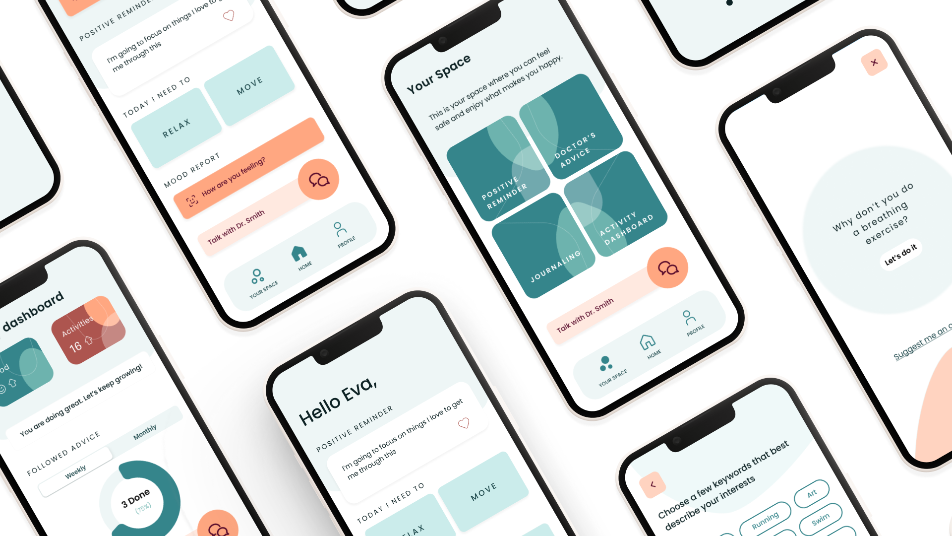
We ideate an application that suggests Eva different activities to do whenever she wants. She can choose between Relax or Move options, and in both of them, she’s going to receive some ideas of things that she can do, most of them not related to digital devices.
Through the application, she will be able to contact her doctor, so they can keep in touch. In addition, she can report every day how is she feeling. That information will generate a report to the doctor that will bring an alarm if she is feeling bad repeatedly, so the doctor can contact her.
Moodboard
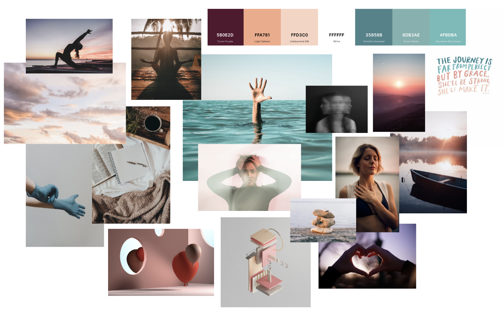
Accordingly to what we wanted to design, we build our mindset style. How we wanted the application to feel and look.

Prototype
All these ideas translated into our first design of the application. We design the onboarding process for the first time Eva or a new user is using the application. They can configure the doctor that is treating them.
Once they get to the home screen, they will see a positive reminder that changes every day. And then, they can choose between relaxing, moving, or going to their personal space.
Mid-Fidelity Wireframes
Hi-Fidelity Wireframes
After finding the unconsitencies of testing the usability of our design with diferent users, here is the result of translating this idea into high-fidelity wireframes.
Now, in their personal space, they can write into their journal, check their favorite positive reminders, check the doctor’s advice and exercises to do, or check the stats about their mood and activity.
Testing
Mid-fi Usability tests
After conducting 6 usability tests through the mid-fidelity wireframes, we found different aspects that could drive users to misunderstand.
- UX Writing
- Need for a dedicated space to see doctor’s advice
- Need to check their activity and stats
Hi-fi Usability tests
We wanted to make sure if there were something missing and for that reason we conducted 6 usability tests. We found different aspects that could drive users to misunderstand.
- The graphics showed in the Activity Dashboard
- More UX Writing
- Multistate Elements Consistency
- Need to add microinteractions, as loading animation
- After applying all these changes here you can see the result of our hi-fi prototype
Desirability tests
Our last step was make sure of the idea we were communicating to the users. We carried out a Microsoft Desirability test and these are the main words we got from the results:
- Reliable
- Cheerful
- Honest
- Sincere
- Good-looking
Retrospective
The next steps to follow in this process will be:
- Test with a bigger amount of potential user’s.
- Launch the first version of the app.
- Analyze the adoption and usage by users.
- Keep working.